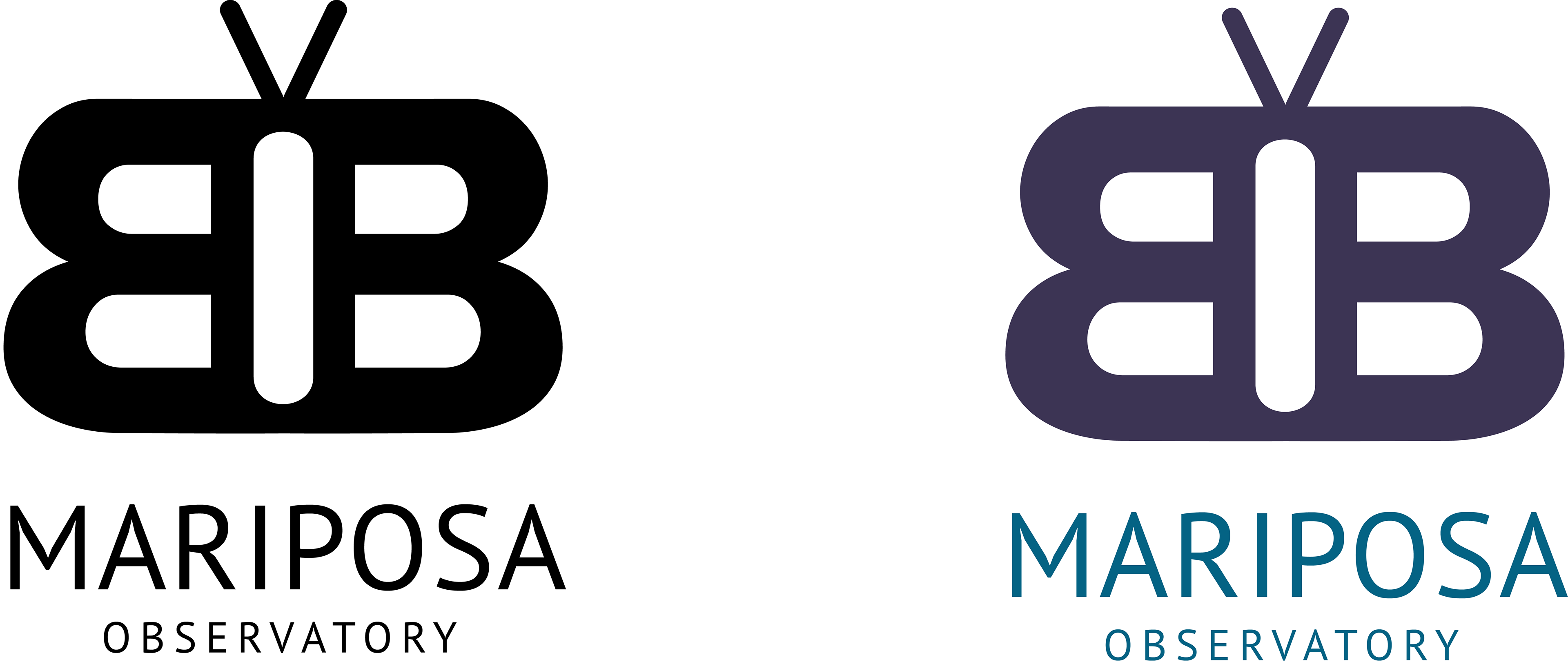
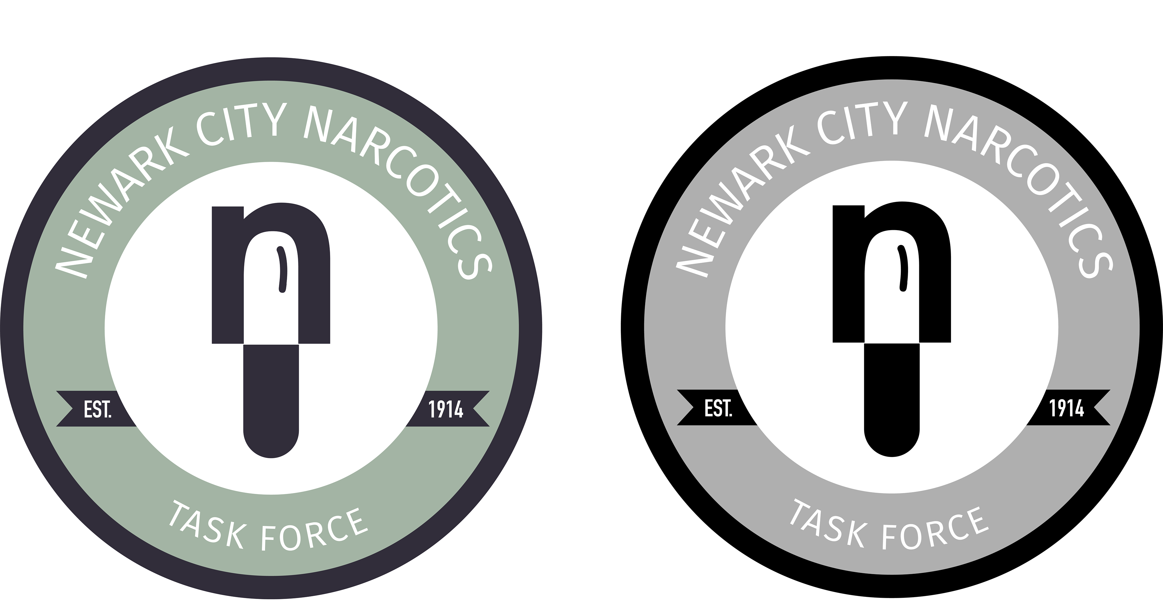
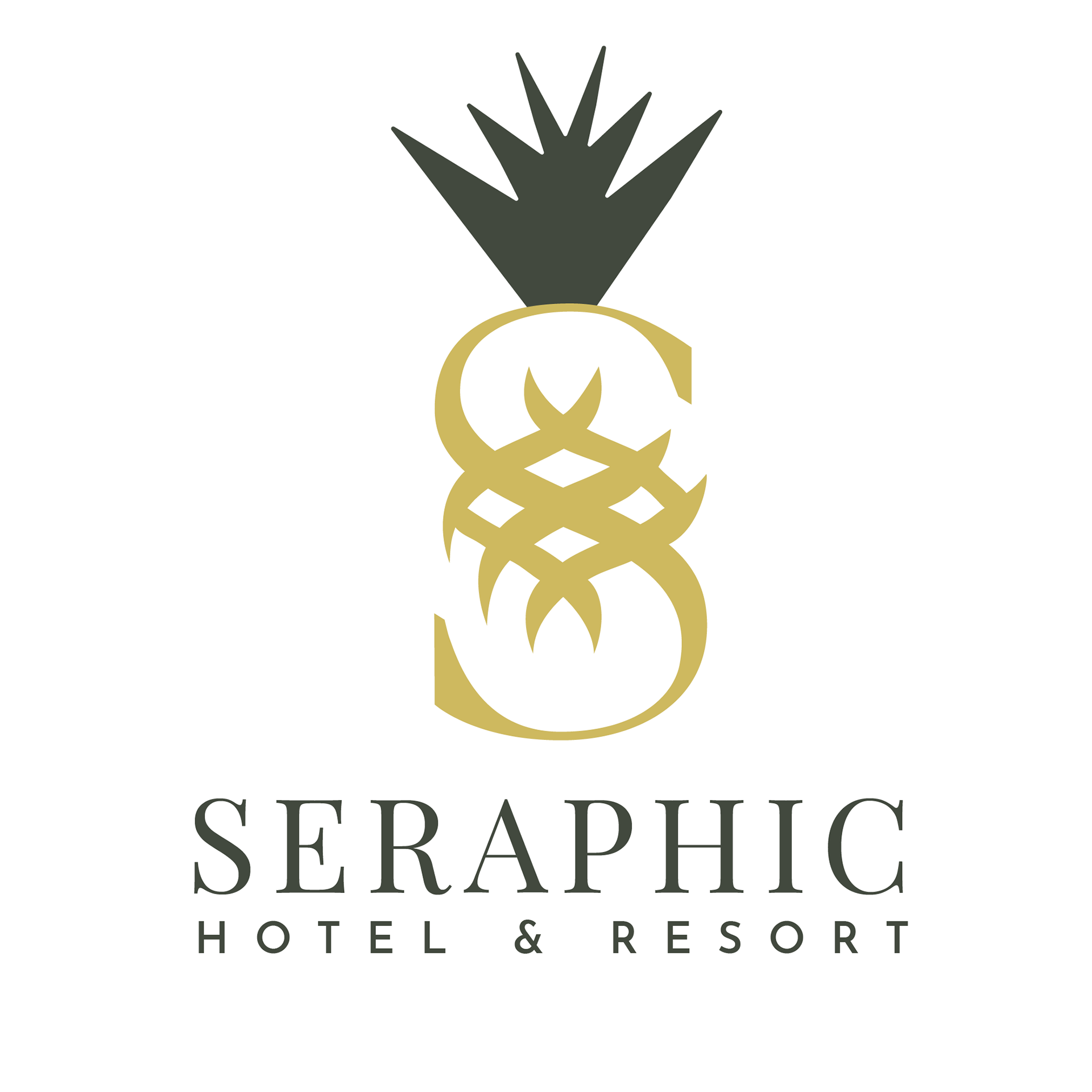
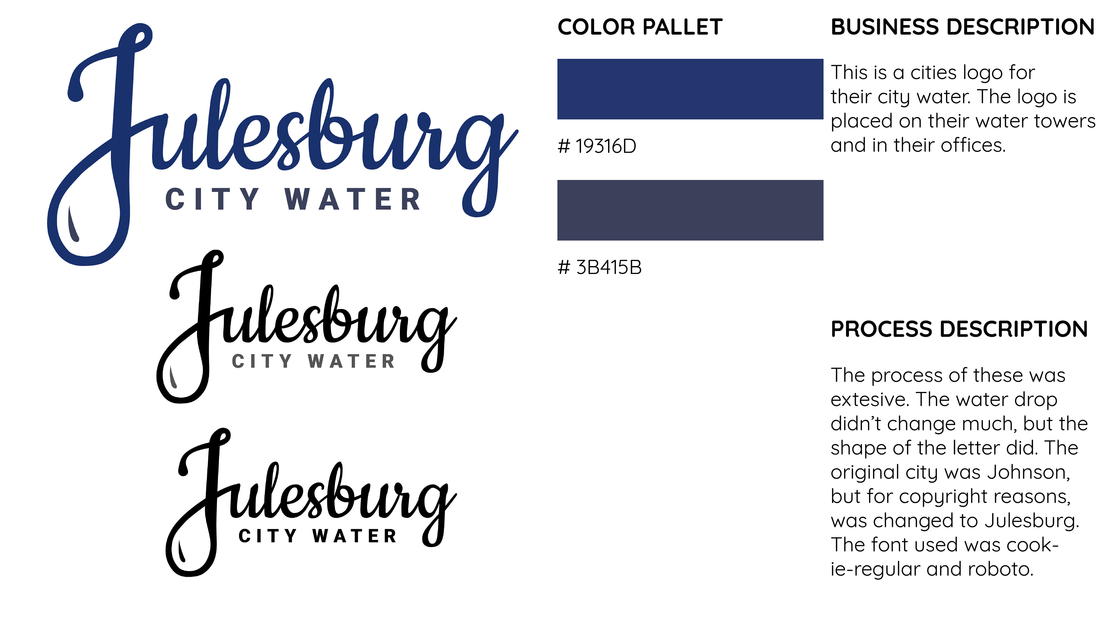
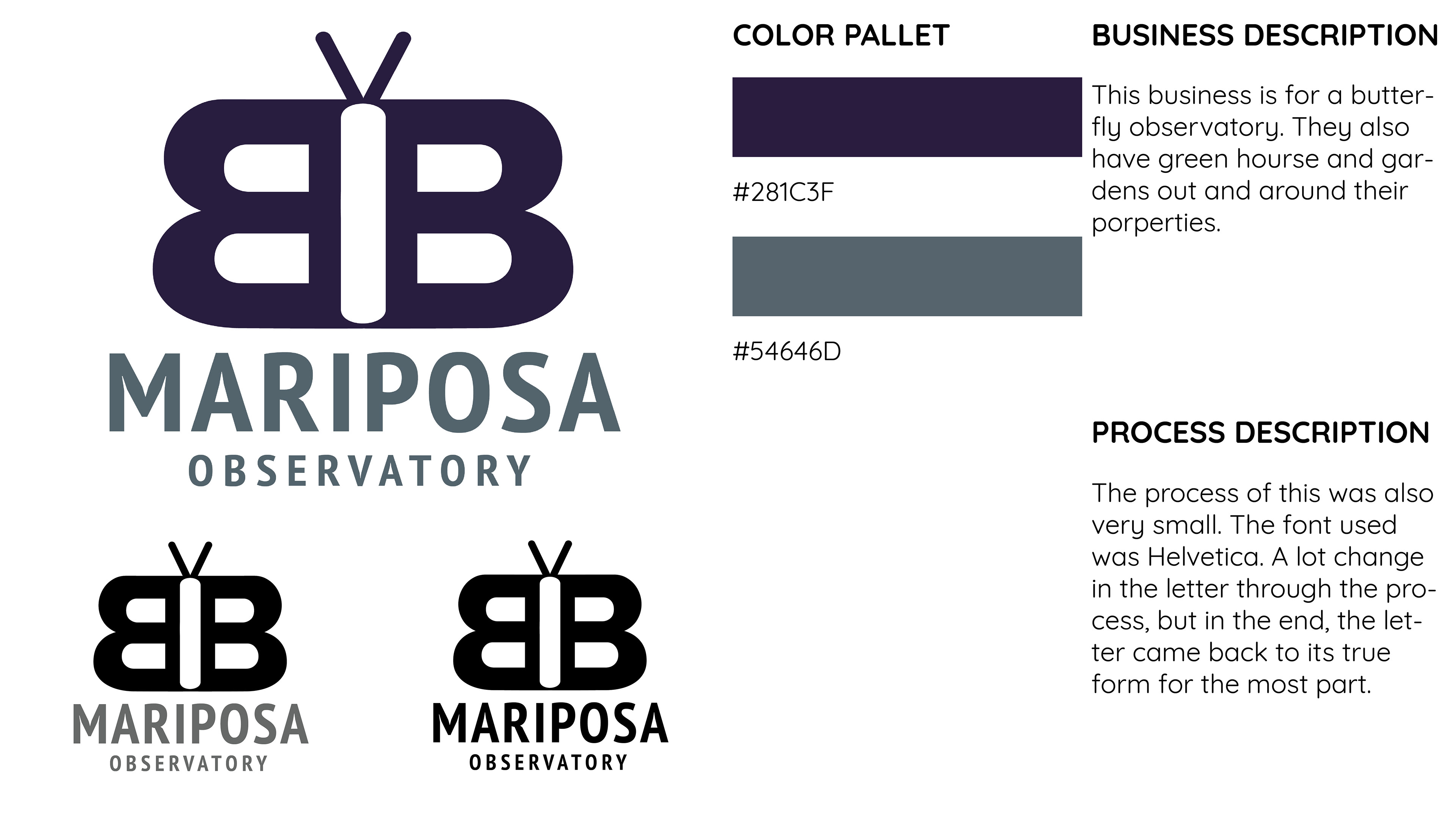
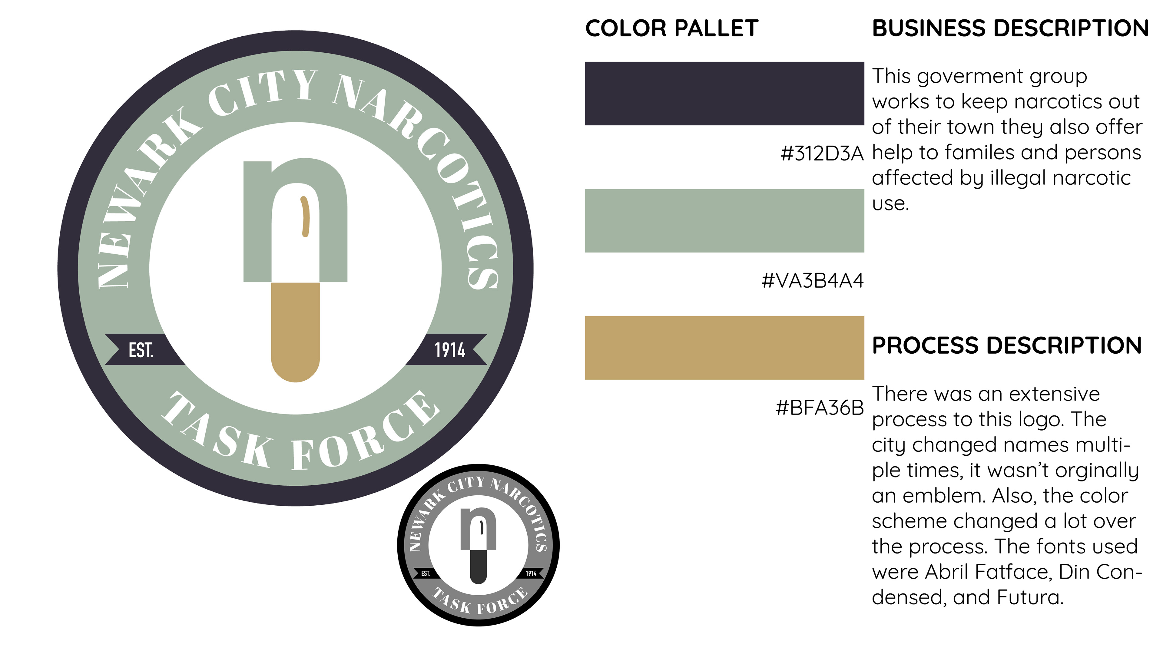
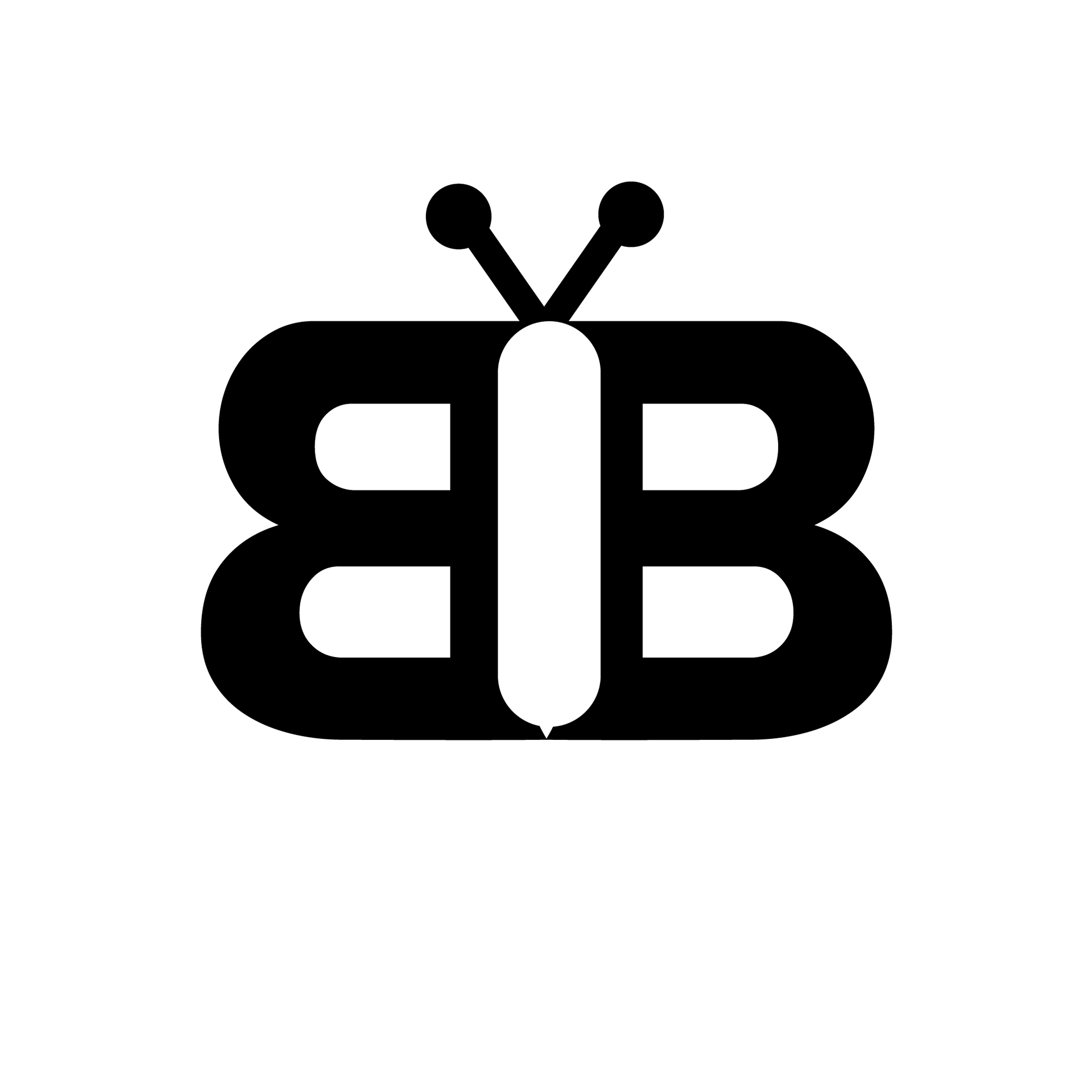
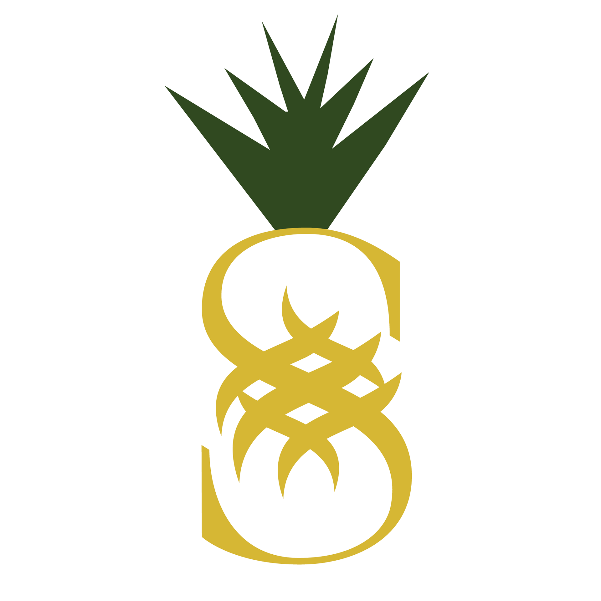
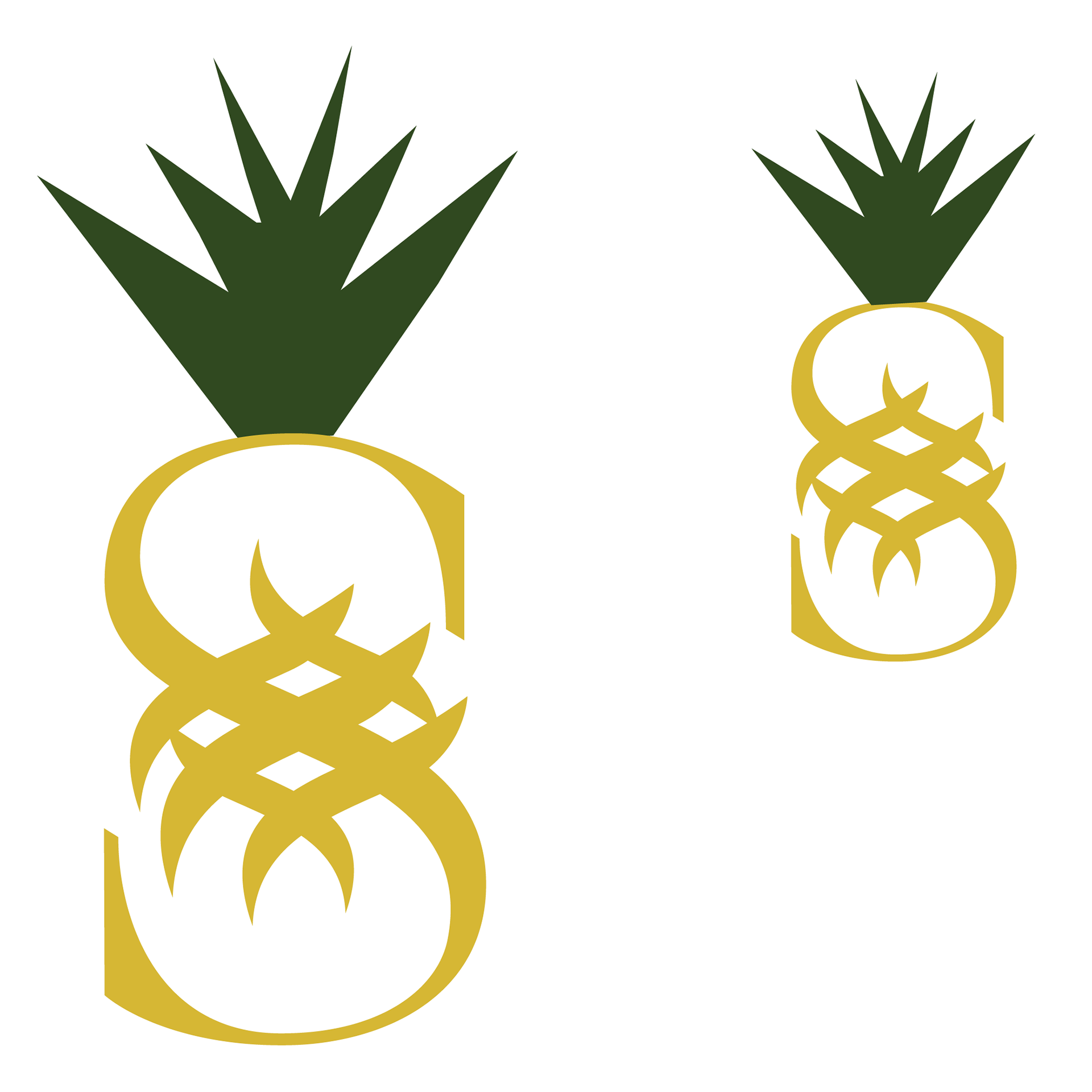
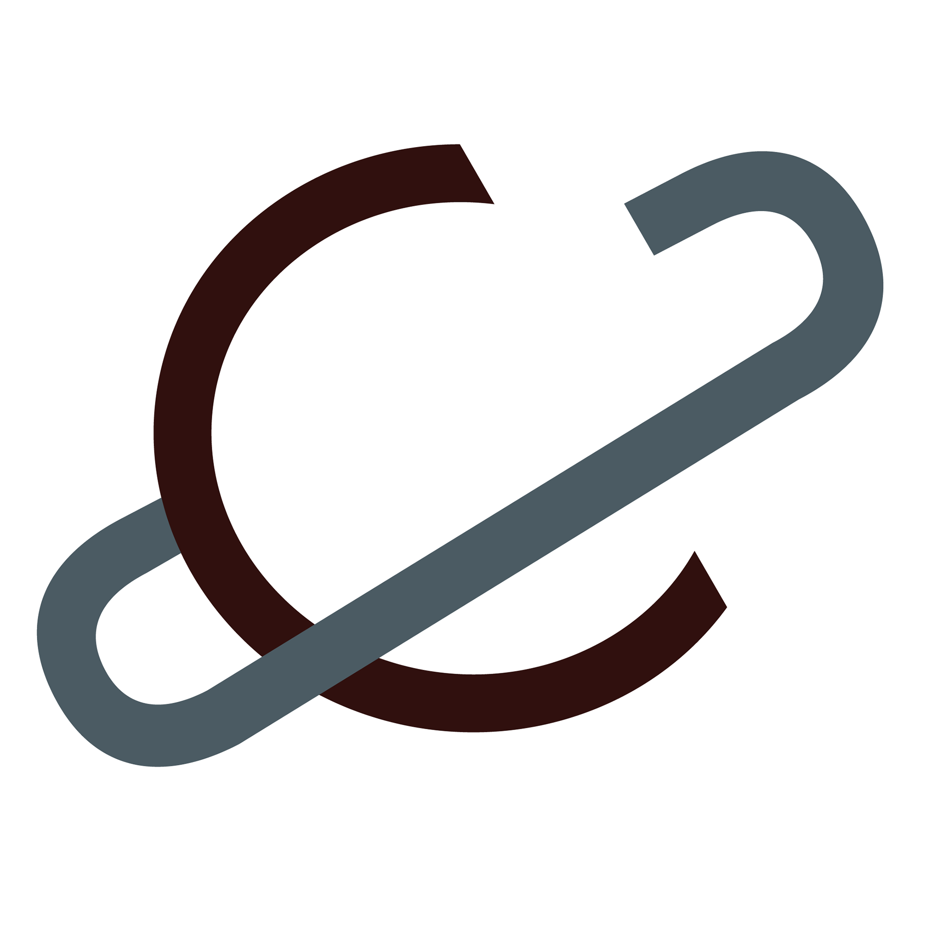
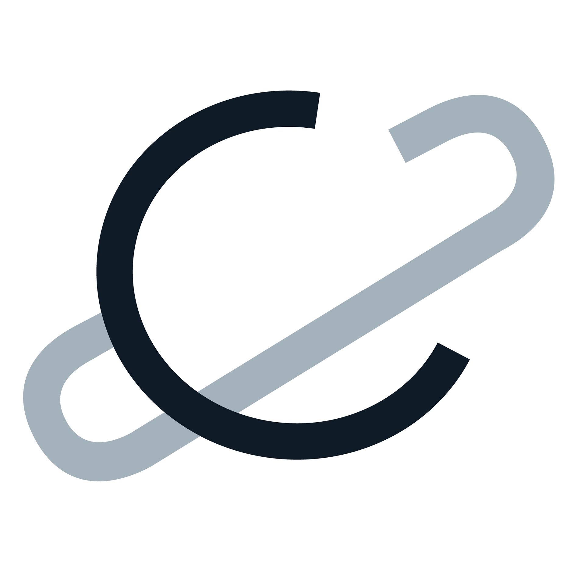
Three logo updates

Turned in FINALS


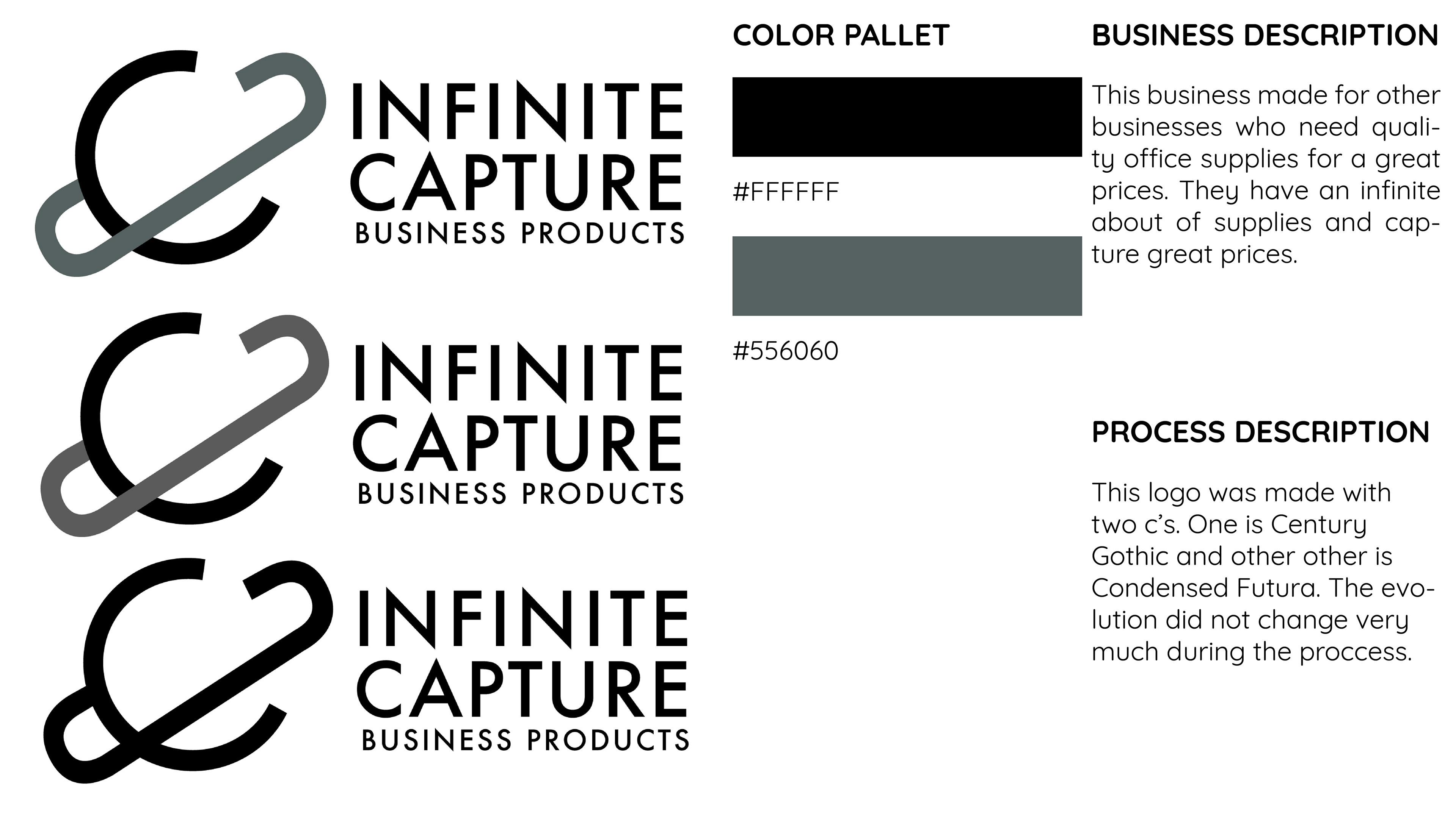


Rough Compositions of the drawings I saw were working. As I moved on in the process, I eliminated about half of these. Either they didn't work together digitally or they were more illustrative than they were a logo.


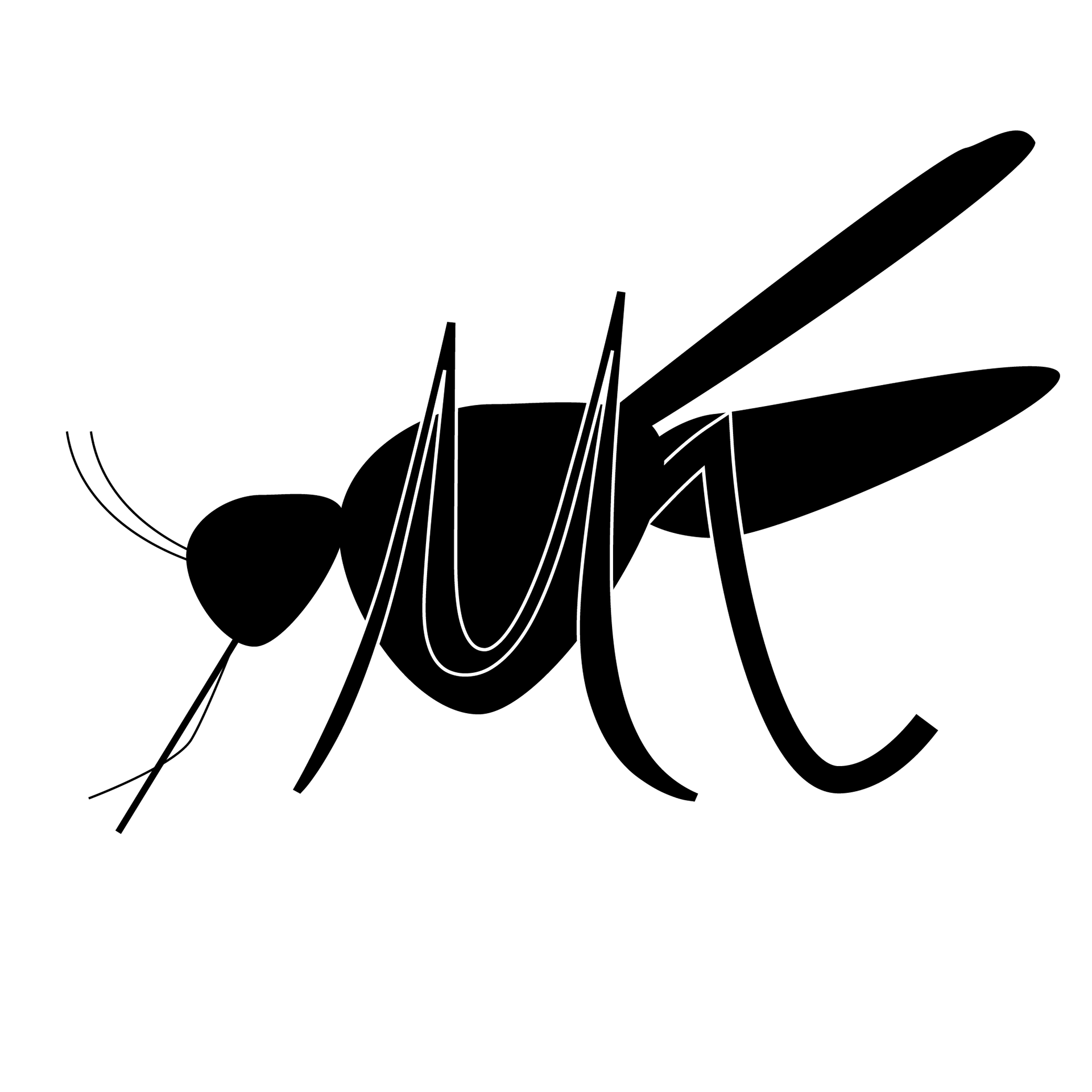
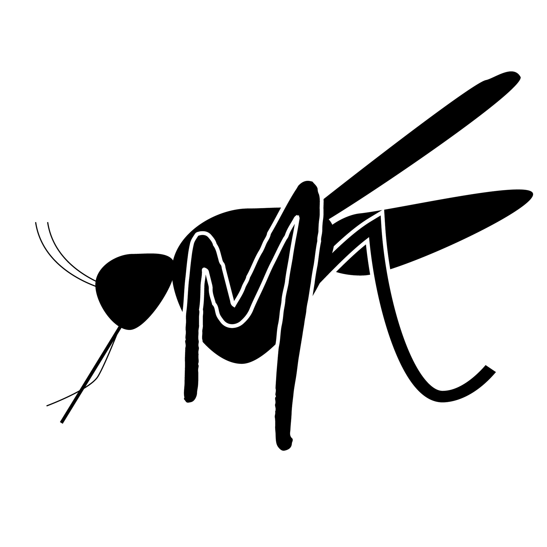


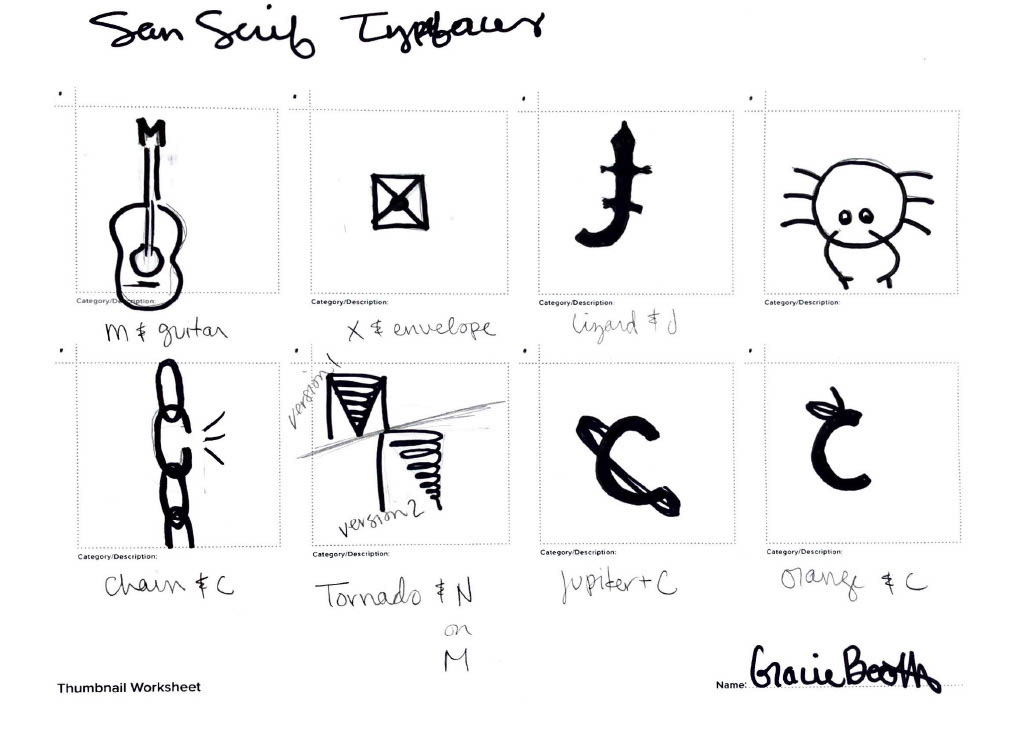
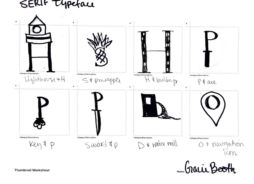
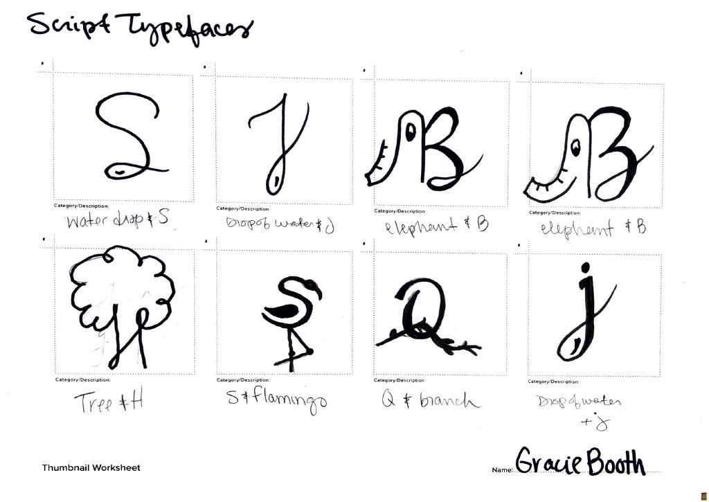
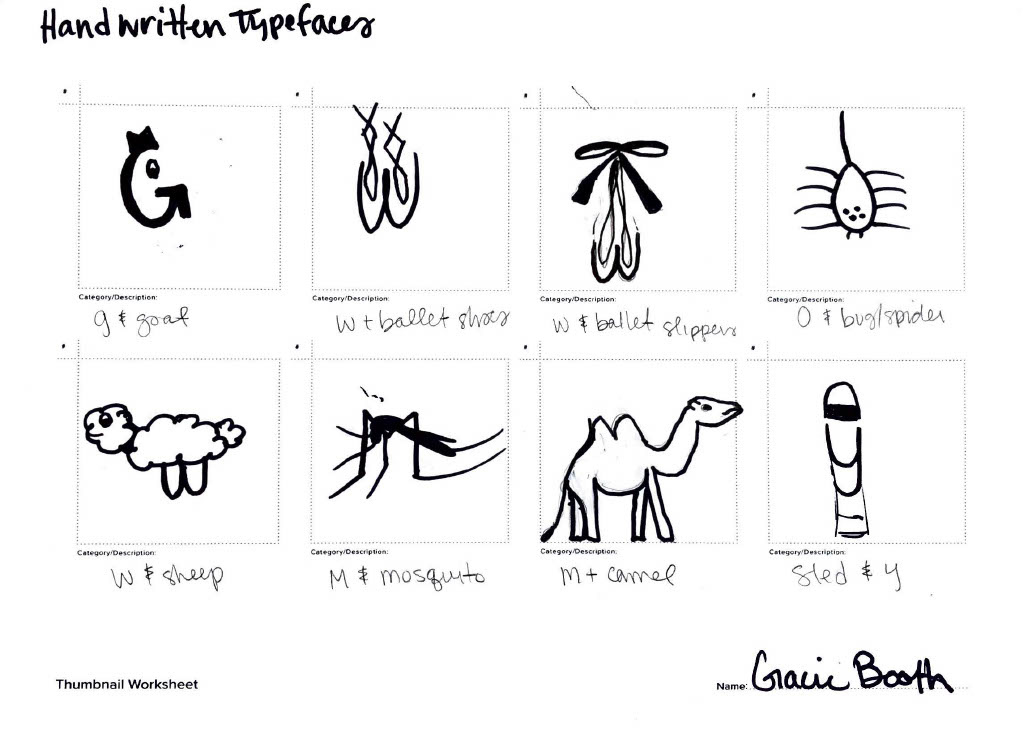
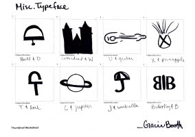
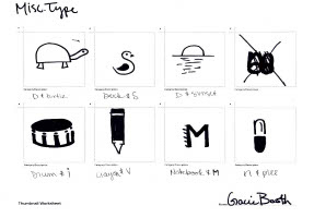
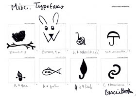
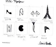
Thumbnails: I took the typefaces and imagery I came up with an turned them into thumbnail drawings to see what the best logo options were.
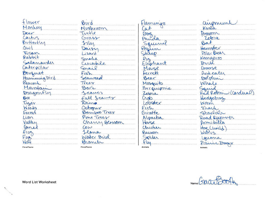
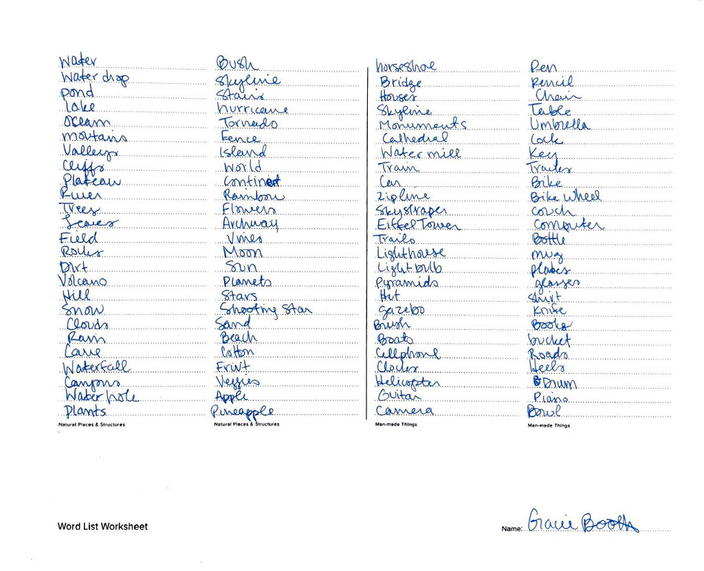
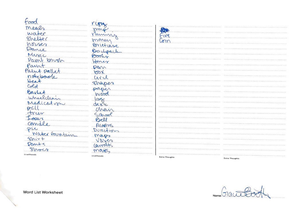
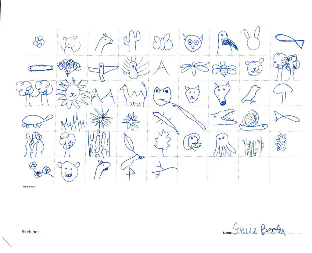
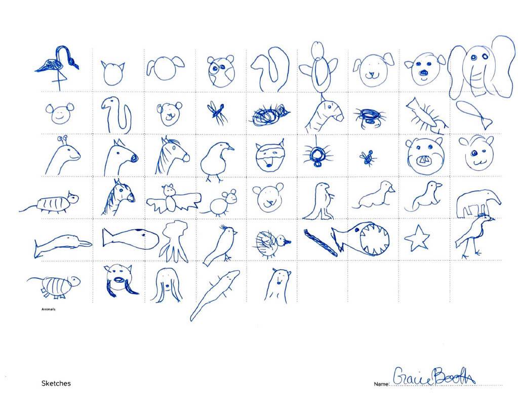
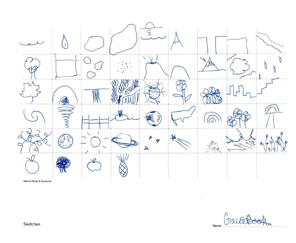
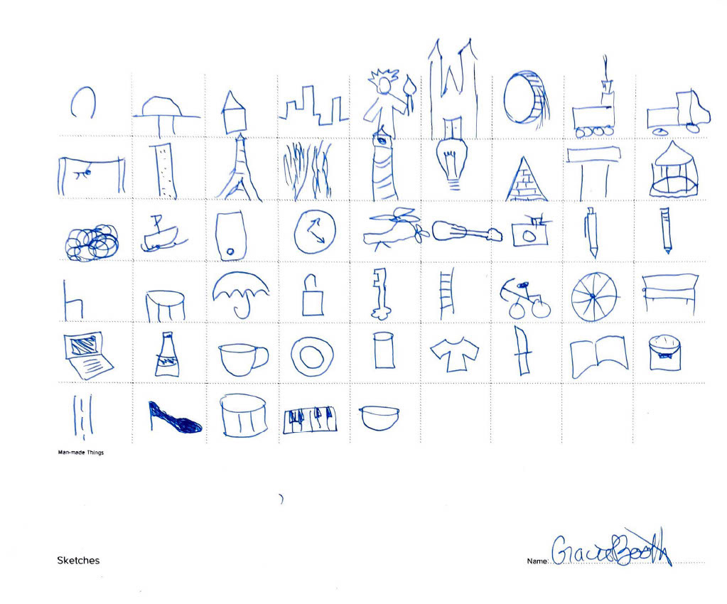
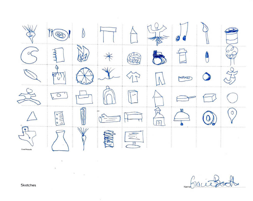
Process Work: The word listing and basic imagery representing each word.
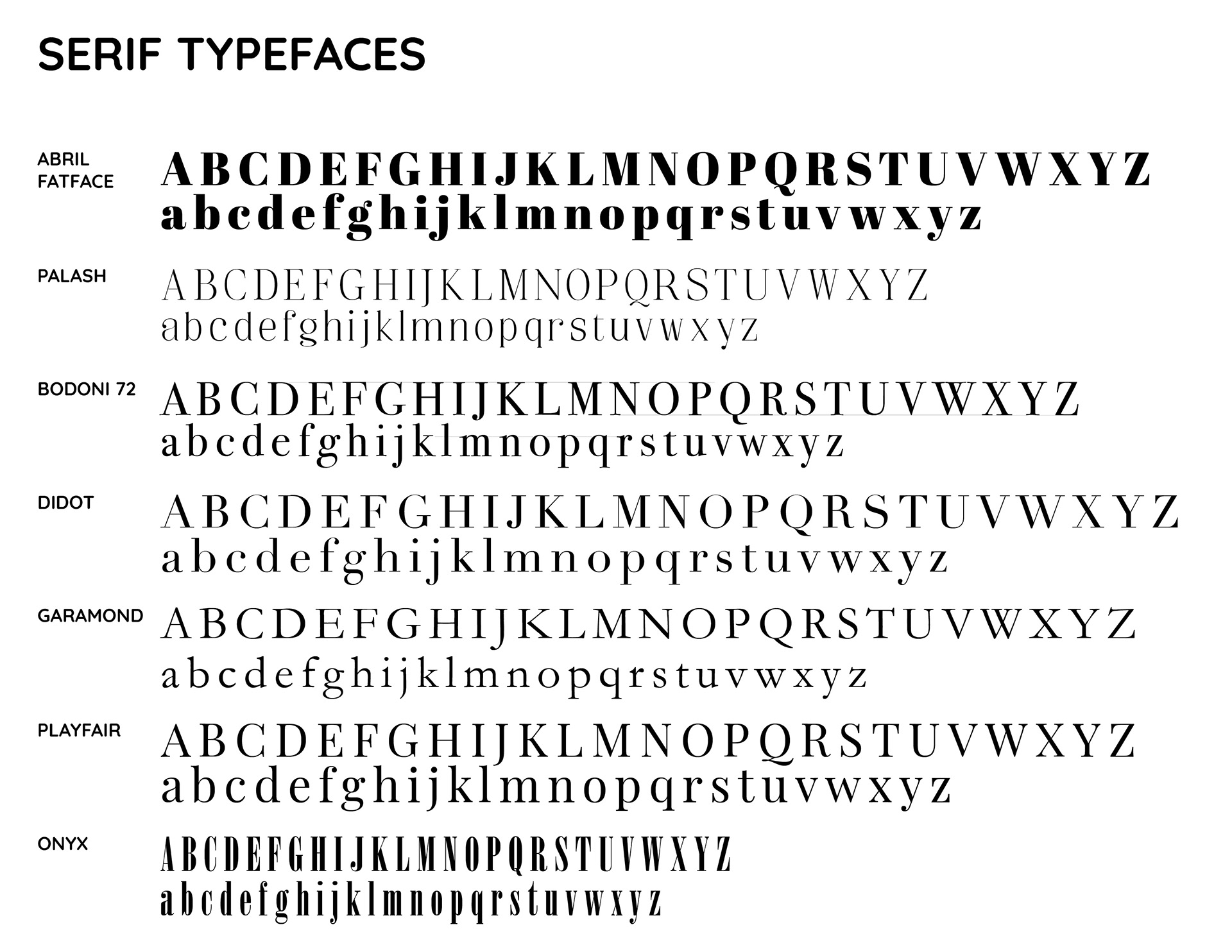
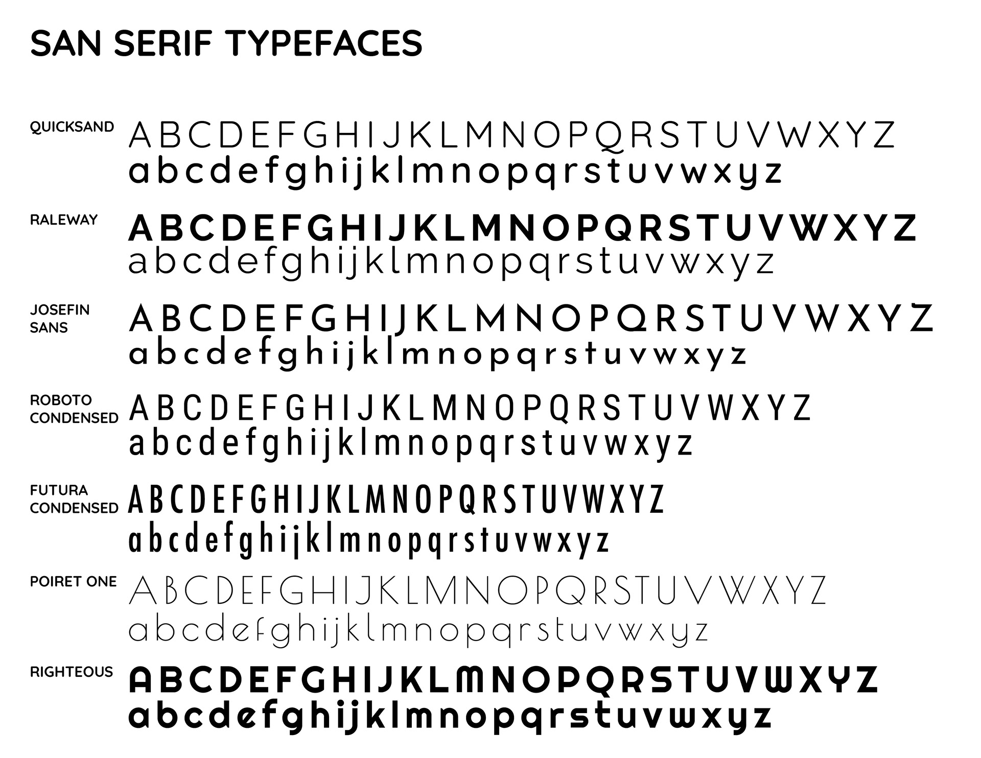
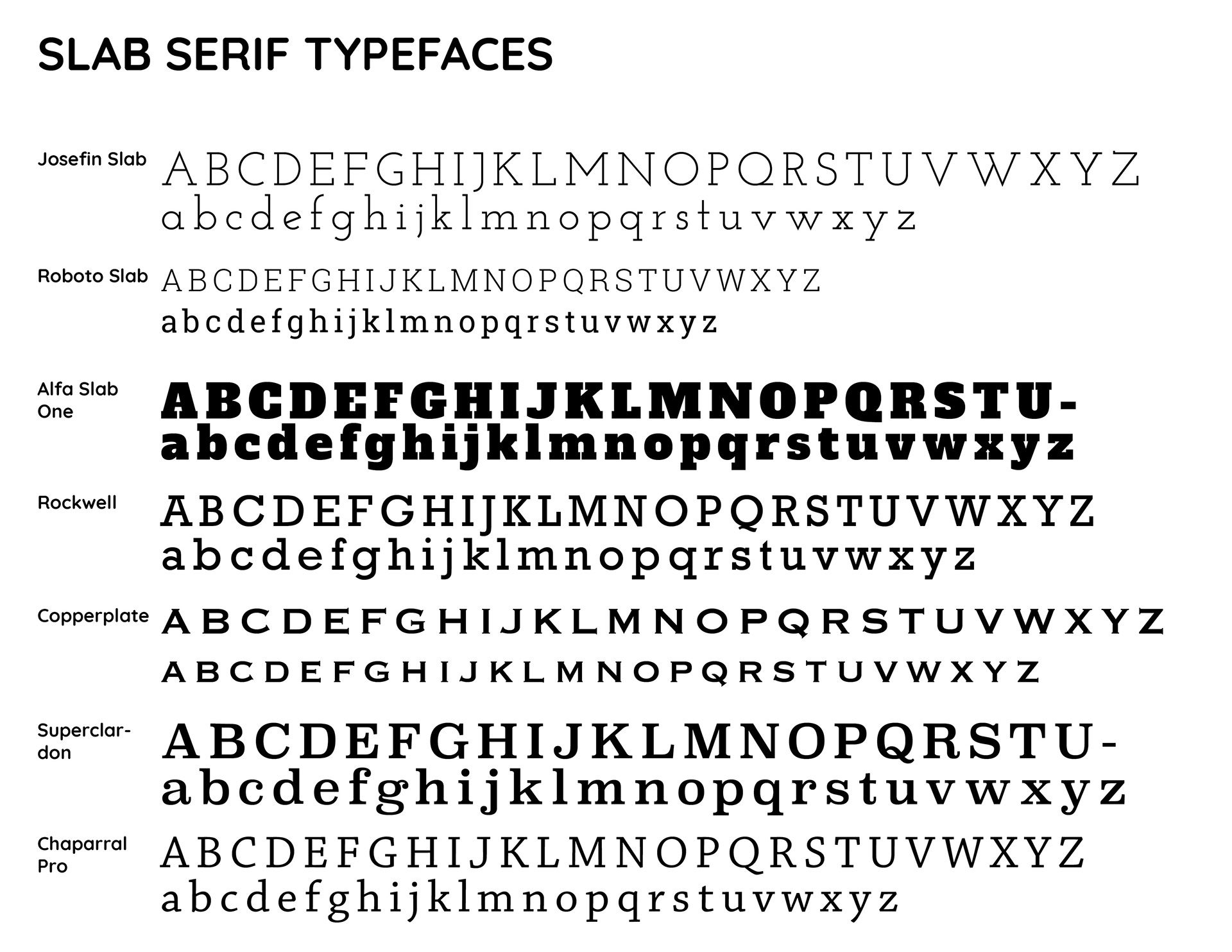
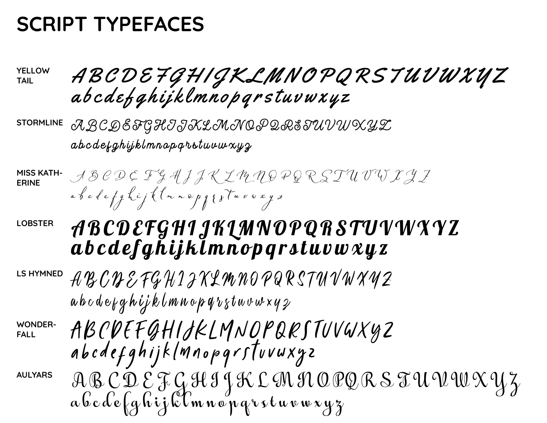
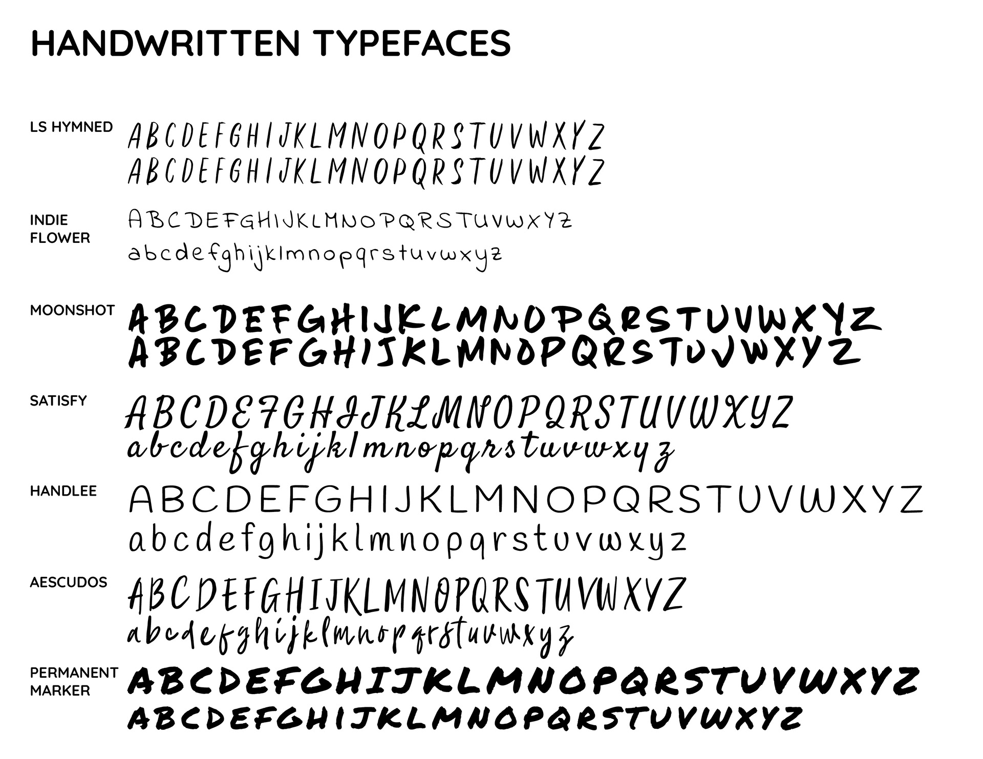
Process Work: Fonts to choose from in as I came up with ideas for images to go with letters.